This article will guide you through what you can do with this section of designing and working with the Activity Landing Page, (formerly Event Page). If you are just starting in designing your Activity Landing page, you will likely want to start here.
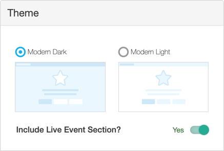
Your first step in creating your Activity Landing Page is to choose the overall theme. There are two themes to choose from: Dark and Light, with a toggle choice to include a Live Event section.
The Dark Theme is the default and is more in line with the current trends of web page design. Each of the sections in your Activity Landing Page will be varying shades of grey. Buttons and highlights will be white or your Campaign Color initially set in your Campaign Settings, but can be adjusted in the Activity Landing Page's Logo & Branding section.
If you prefer the Light Theme, then the sections in your Activity Landing Page will either default to white or your Campaign Color initially set in your Campaign Settings, but can be adjusted in the Activity Landing Page's Logo & Branding section.
The Live Event toggle adds a Live Event section. This allows you to have a video instead of images for the hero or initial section at the top of your Activity Landing Page. By turning on/off the Live Event in the Live Event section or the Image Hero section you can toggle from something like a slideshow of images before you go live using the Image Hero, and then you can switch to the Live Event when you live stream. For more on the Live Event section, click here.
Feature | Dark Theme | Light Theme |
| Logo & Branding: Brand Color | Campaign Color | Campaign Color |
| Logo & Branding: Background Color | Very Dark Grey | White |
| Banner: Background Color | Mostly Black | Brand Color |
| Banner: Navigation Links/Accents | White | White |
| Banner: Social Shares | White | White |
| Banner: Hero Primary Button | Brand Color with White Text | Brand Color with White Text |
| Hero: Text | White | White |
| Hero: Primary Button | Brand Color with White Text | Brand Color with White Text |
| Hero: Secondary/Supporting Buttons | White with Brand Color Text | White with Brand Color Text |
| Background | Very Dark Grey / Background Color | White / Brand Color |
| Keyword: Main Text | White | Black |
| Keyword: Initial Keyword/Shortcode Text | Brand Color | Brand Color |
| Event Details: Text | White | White |
| Event Details: Accents | Brand Color | White |
| Event Details: Action Button | Brand Color with White Text | White with Brand Color Text |
| Event Details: Background | Very Dark Grey, but lighter than default Background color | Brand Color |
| Impact: Main Text | White | Black |
| Impact: Accents | Brand Color | Brand Color |
| Impact: Card Title | Brand Color | Brand Color |
| Impact: Card Text | White | Black |
| Impact: Card Amount | White | Black |
| Impact: Card Buttons | Brand Color with White Text | Brand Color with White Text |
| Impact: Background | Very Dark Grey / Background Color | White |
| Sponsors: Text | White | Black |
| Sponsors: Accents | Brand Color | Brand Color |
| Sponsors: Action Button | Brand Color with White Text | Brand Color with White Text |
| Sponsors: Background | Very Dark Grey / Background Color | White |
| Sponsors: Images | Default / In Color | Greyscale |
| Footer: Text | White | Black |
| Footer: Button | Brand Color with White Text | Brand Color with White Text |
| Footer: Background | Dark Grey | Very Light Grey |
| Footer: Disclaimer Line | Very Dark Grey, but lighter than default Background color | Very Dark Grey |