This article will guide you through customizing your Image Hero section on the Activity Landing Page (previously called the Event Page). If you are just starting to design your Activity Landing Page, you will likely want to start here.
The Image Hero section contains a large image or carousel of images, prominently placed on the page. The hero image is often the first visual element seen on the page.
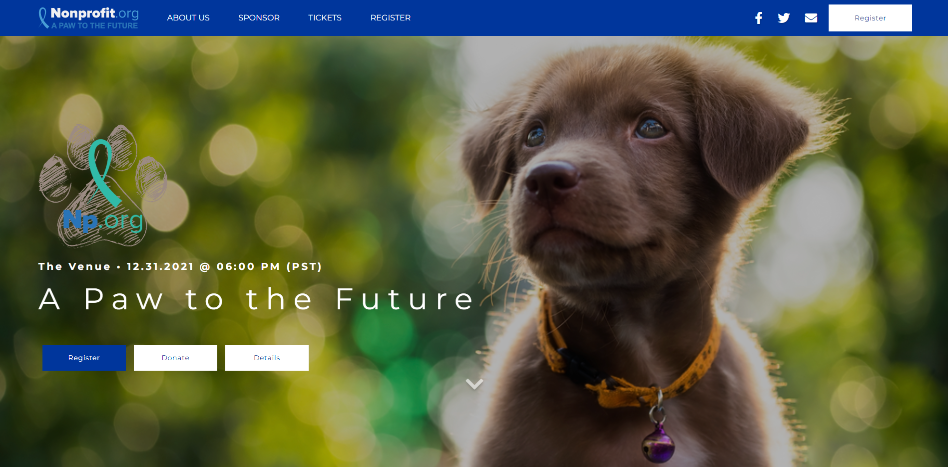
This is your opportunity to highlight the heroes of your story. Add an image, a logo for the Event and up to three action buttons, inviting your guests to take action.
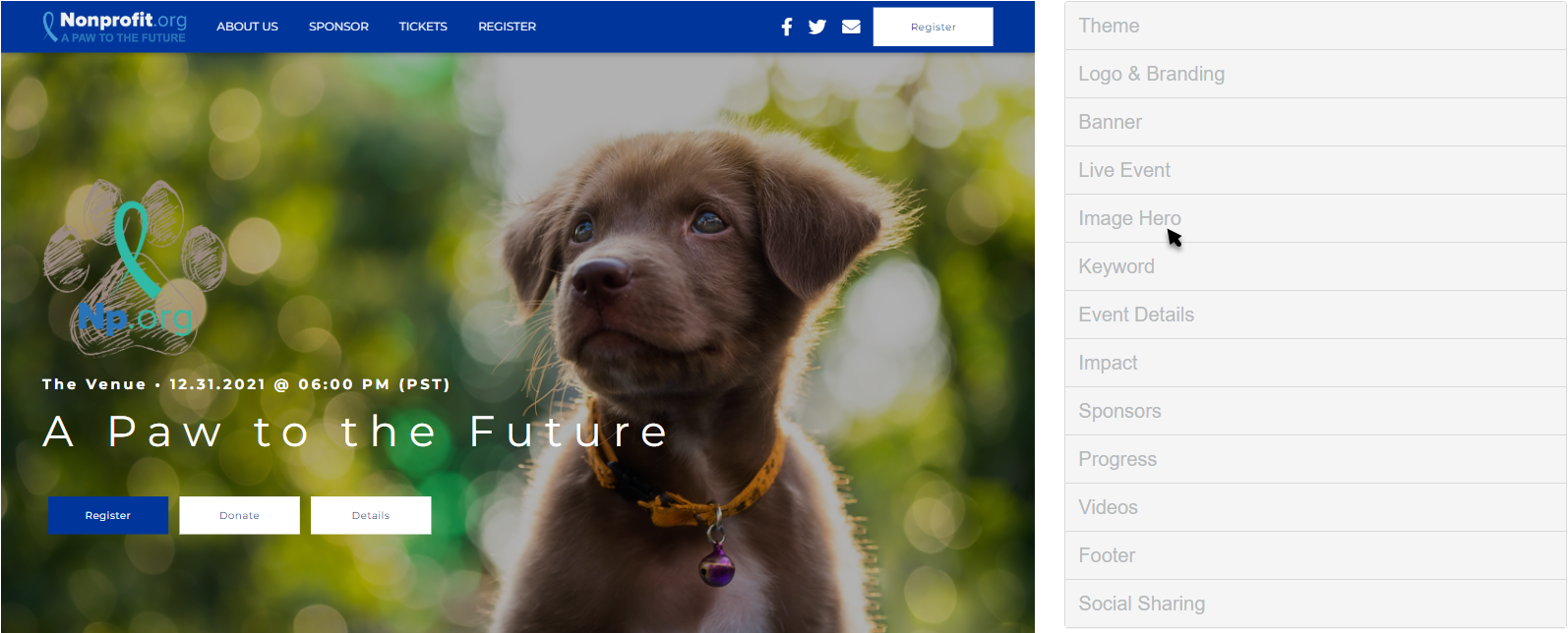
Customize the Image Hero section in the Activity Landing Page designer.
Display Section
If you decide against using the Image Hero section, you can hide the entire section with the Show/Hide switch.
Show Overlay
By default, an overlay will darken your image so the text on your page is not lost in the image. If you prefer to turn off the overlay, toggle the Show/Hide switch to hide.
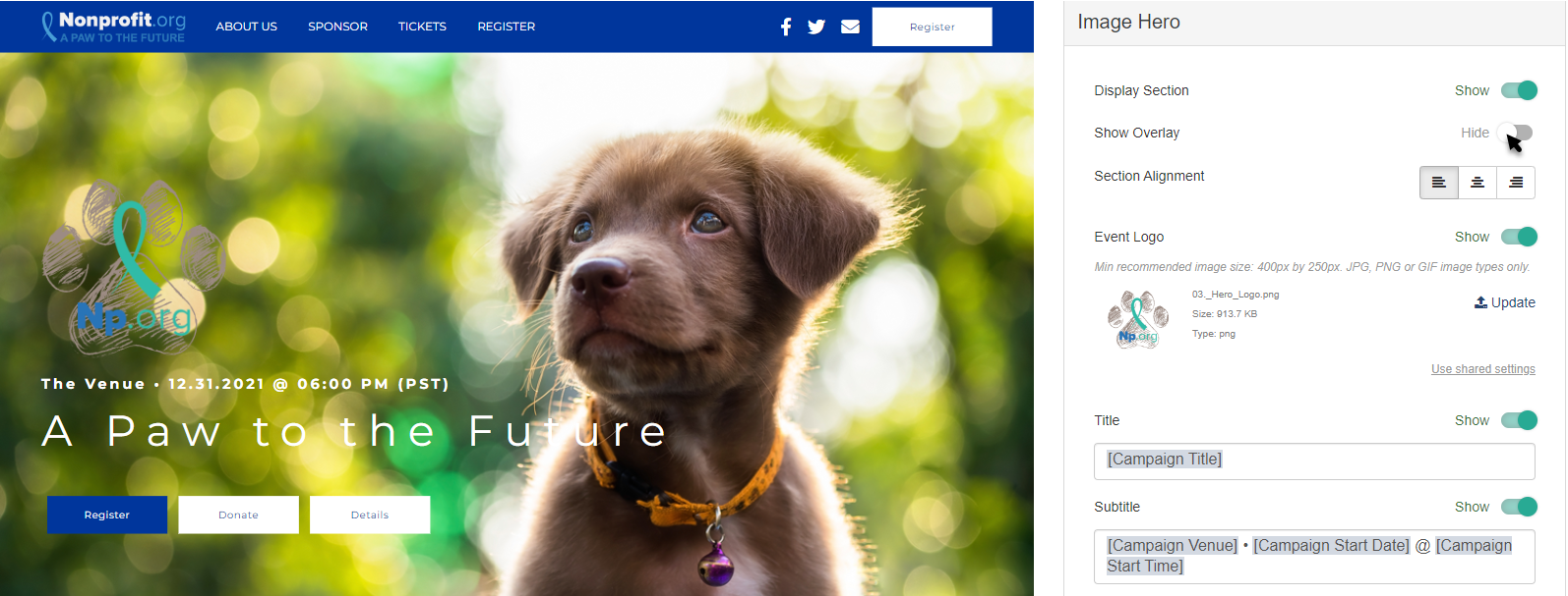
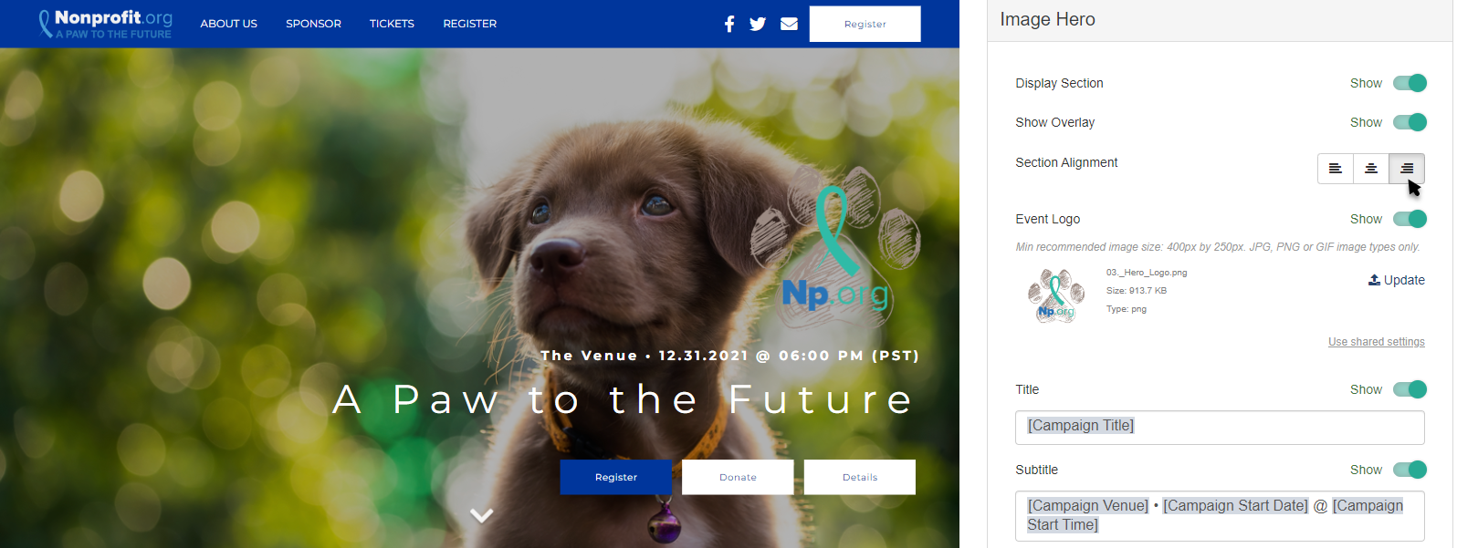
Section Alignment
Click the Left, Center, Right icons to alter the alignment of the text and logo of the Hero section.
Event Logo
By default, the Event Logo in the Hero section is copied from the logo selected in the Logo & Branding section. If you would prefer to have a different logo, such as a unique one for your event, placing it prominently in the Hero section would be a good place to include it. You can change the logo by clicking Update.
Select an image from your system to upload.
Crop the image as needed and click Crop and Save or select Use Original.
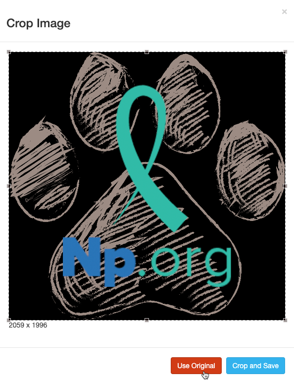
For best results, the Logo should be at least 150px by 150px. It doesn't need to be square, though. For more information on Image Sizes, click here.
If you don't want a Event Logo image in the Hero section, you can hide it by clicking the Show/Hide switch.
Title
By default, the Title will be the the special variable [Campaign Title]. The Title pulls from the Campaign Details. You can change the Title from the Campaign Details, as described here, to insure that the Title matches your various activities, such as Ticketing.
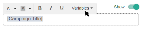
In the Image Hero section, you can edit the Title to be anything you wish and include different formatting. You can also choose other variables from the drop down list.
Subtitle
The Subtitle is very similar to the Title. It appears above the Title and by default includes the special variables: [Campaign Venue] [Campaign Start Date] @ [Campaign Start Time] from the Campaign Details as described here.
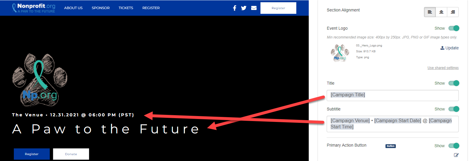
You can edit the Subtitle to be anything you wish and include different formatting, in the same way as the Title. You can also choose other variables from the drop down list.
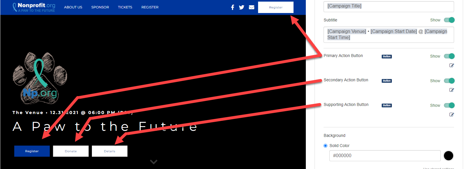
Primary/Secondary/Supporting Action Buttons
You can include up to three different Action Buttons in the Hero section. The Primary will always be first, followed by the Secondary and then the Supporting Action Button. If any button is not used (hidden with the Show/Hide switch), the next button will shift so they maintain the design.
The Primary button differs from the other two in that it will be the Activity Landing Page Brand Color.
Click on the Edit icon to change the wording of the Button and link it to an existing form or external link.
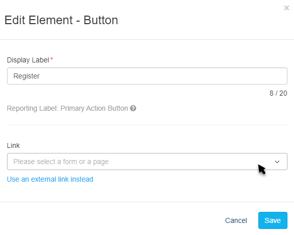
Display Label
The Display label will be what appears on the Button. You have up to 20 characters for the Button text.
Link
The Link defaults to a drop down menu where you can directly add the link to any other form within the campaign to your Activity Landing Page. You can start typing the name of your form to narrow your selection.
You can also click Use an external link instead to direct your supporters to and external URL page. If you change your mind about using an external link, you can click Use a GiveSmart Fundraise link instead to revert to the original design.
Make sure to Save the Button settings after you make changes.
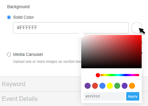
Background
The Background of the Hero section starts as a solid color. This can be changed to a different color or a media carousel.
Solid Color
When in Dark Theme, the Hero Solid Color is a dark grey by default (hex code #333333). In the Light theme, the Solid Color is white (hex code #ffffff).
To change the Solid Color, enter a color's hexadecimal code or click on the color picker and select the color of your choice by using the color bar or dragging the circle around the color field. There are also default colors you can select or use as a starting point. Once you've selected a color on the color picker, click apply.
Media Carousel
Instead, you can use one or more images for your Hero section.
Click on the Edit icon to add or edit images for your Hero section.
Click Upload to add images.
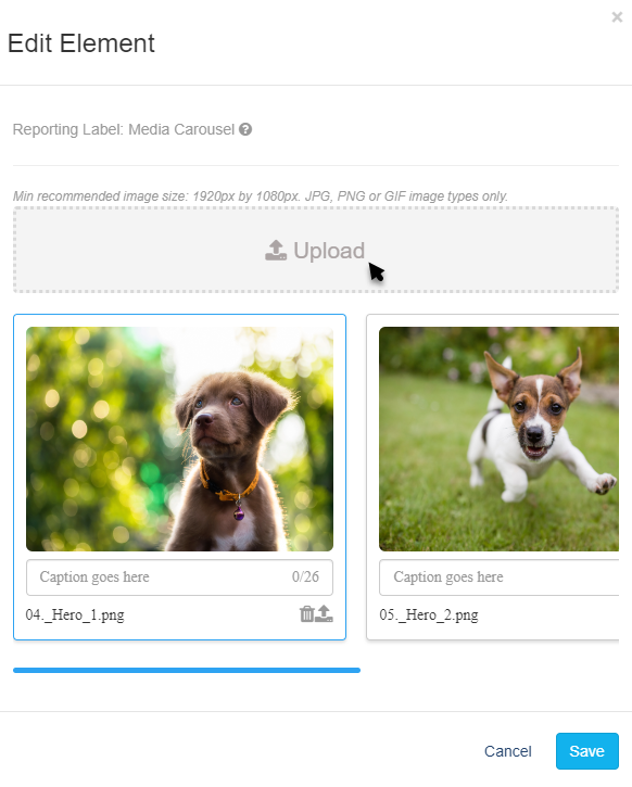
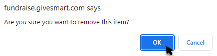
Click the Trashcan to remove an image from the carousel. You will get a warning before it deletes.
Click the Upload icon (the icon next to the Trashcan with the up arrow next to it) to swap out an image.
When you have multiple images, you can click one image and drag it to change the order for the carousel.


With your Image Hero section set up, your Activity Landing Page is starting to pull together. Check out the Activity Landing Page Design article for next steps.