GiveSmart Fundraise forms are designed to follow current best practices for online donations and to make the donation experience as easy and frictionless as possible for your donors. However, the way you add your GiveSmart Fundraise Donation form to your website has the potential to impact your conversion rates (% of unique visitors to your donation page that complete the transaction). Here are some tips for adding a donation form to your website.
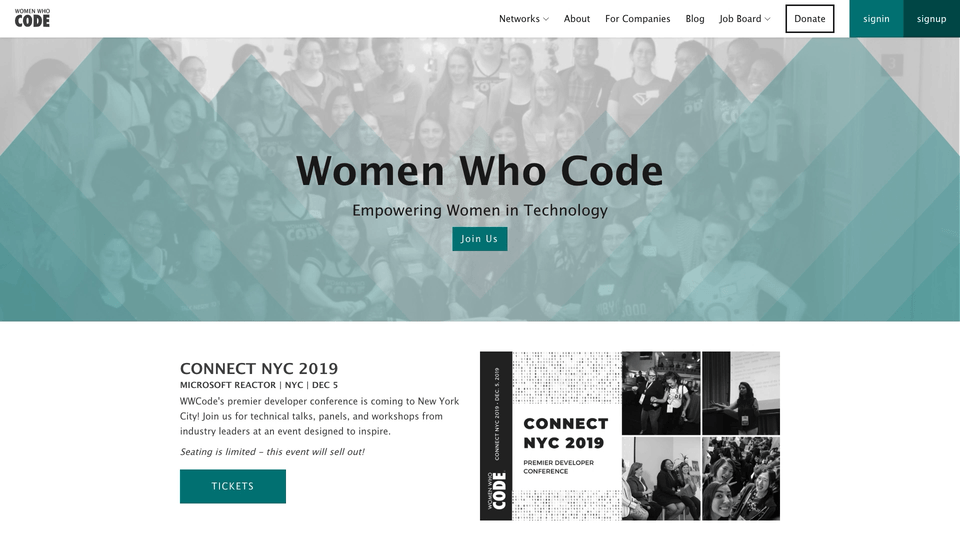
Tip 1: Make your donation button/ link easy to find
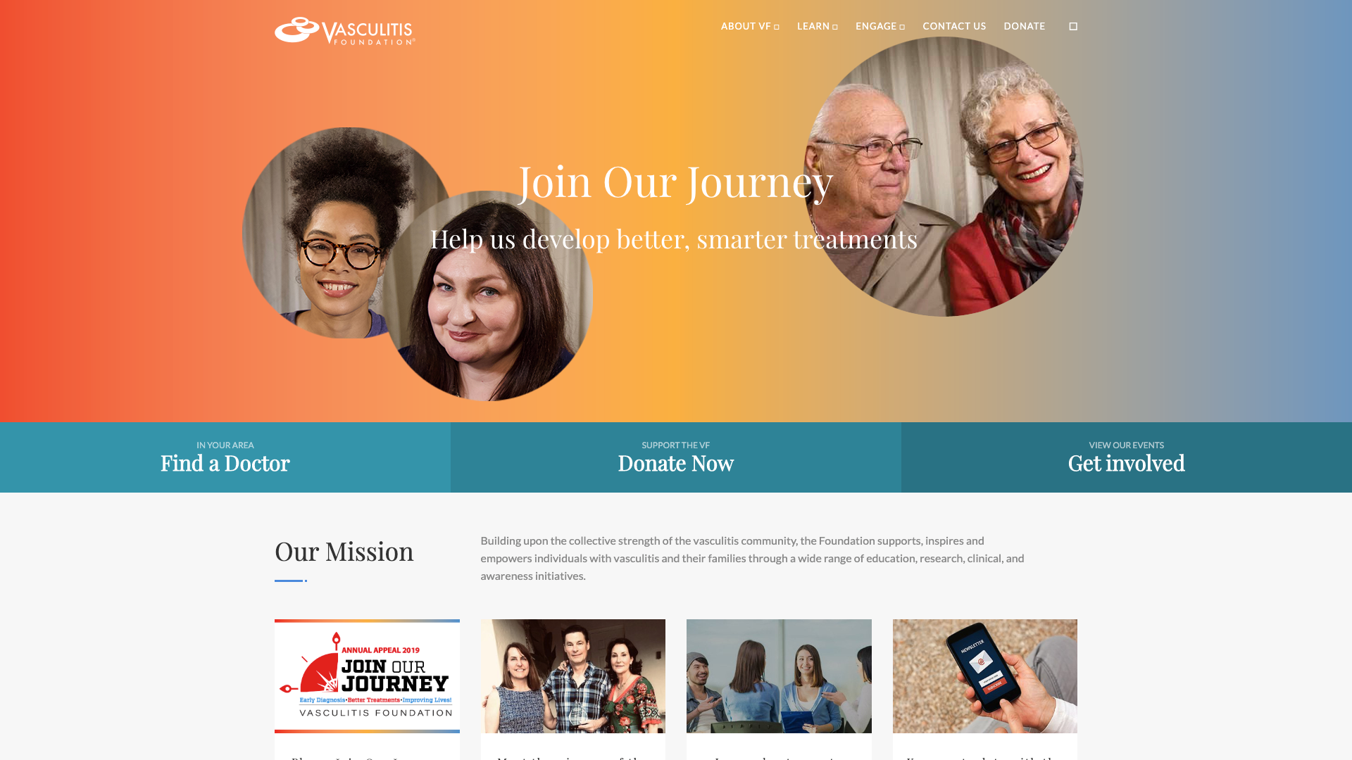
A user should be able to find your donation button/link within 1 second of the page loading. This button/link needs to be part of the top navigation found in the website’s header. One common best practice is to use a shade of orange or red to highlight this button/link. This choice of color immediately catches the eye.
Tip 2: Link Directly to the Donation Process.
Research shows that more than three clicks will cause a donor to abandon the process and reduce your donation conversion rate.
When someone clicks a donation button or link, they should be taken immediately to your GiveSmart Fundraise form. For an even better donor experience, consider embedding your website donation form on your organization’s website. (Please note that Crowdfunding/ Peer to Peer pages are not designed to be embedded)
A common mistake is to insert an additional page with lots of text about the different ways to give, which then requires the users to click a donate button again. This concept makes sense at first glance (there are more ways to give than just online donations after all), but every extra step in the process will reduce conversion rates which at the end of the day means less money for your cause.
Tip 3: Add clear calls to action throughout your website
Easily visible donation buttons are perfect for those who already intend to give, but many visitors will require a little persuasion. Strategically place donation calls to action throughout your website. Include a few words or sentences inviting them to join you in making an impact.
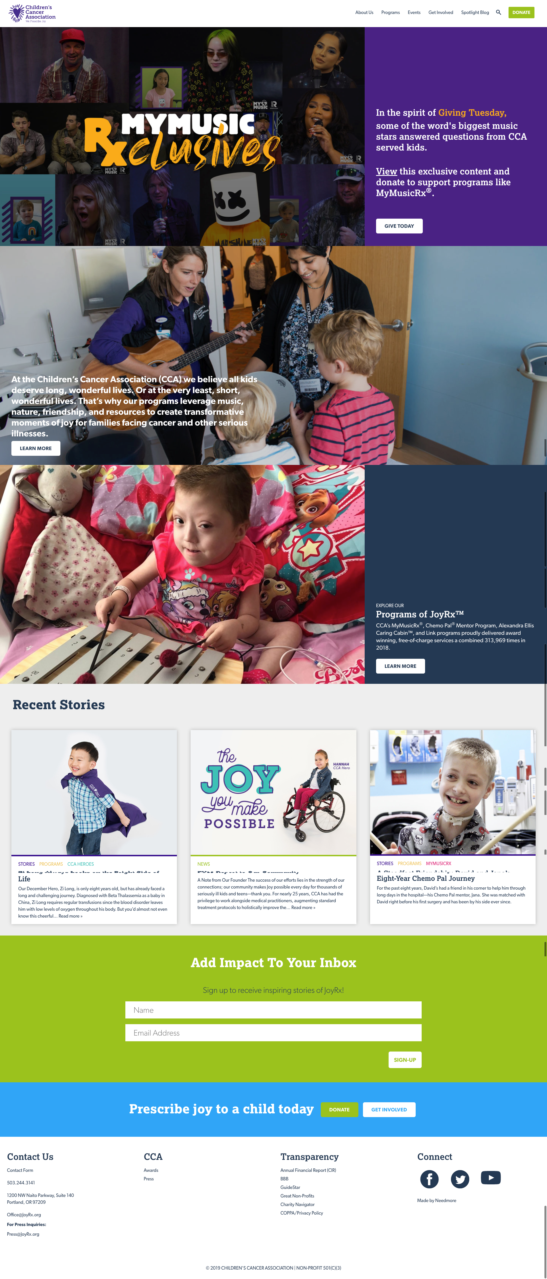 High contrast buttons are visible throughout the site with either Donation requests or links to more information easily identifiable.
Tip 4: Switch out Your Forms for Special Fundraising Campaigns (optional)
Approximately 20% of people who respond to one of your online appeals will opt to go directly to your website to make their donations. So, for example, if you would like to make sure that all people who give on Giving Tuesday, make a gift on your Giving Tuesday form, temporarily switch out your evergreen website donation form for a temporary campaign-specific form. Also, make sure more information about your special campaign is in a prominent place on your website and is easy for someone to find when arriving to your homepage.