This article will guide you through designing the Banner on the Activity Landing Page (previously called the Event Page). If you are just starting to design your Activity Landing Page, you will likely want to start here.
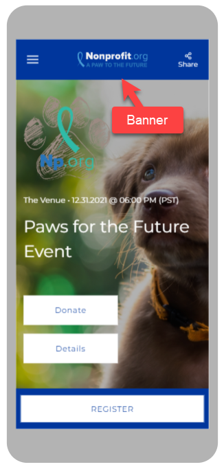
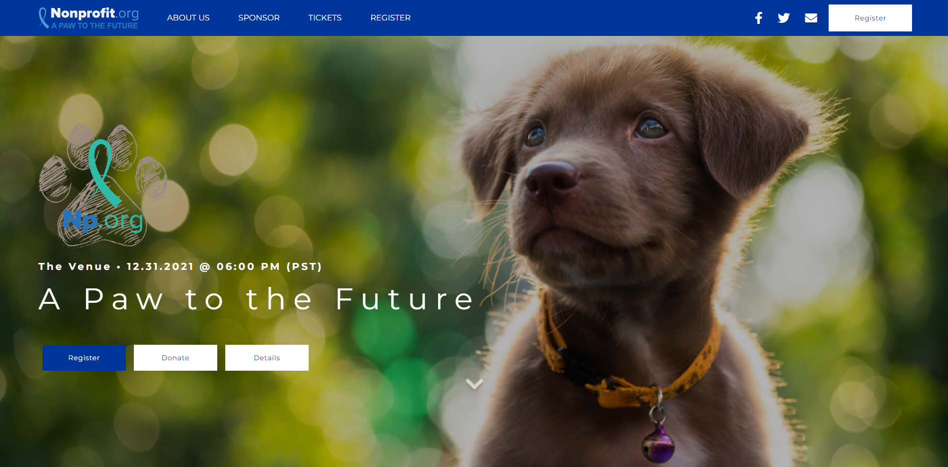
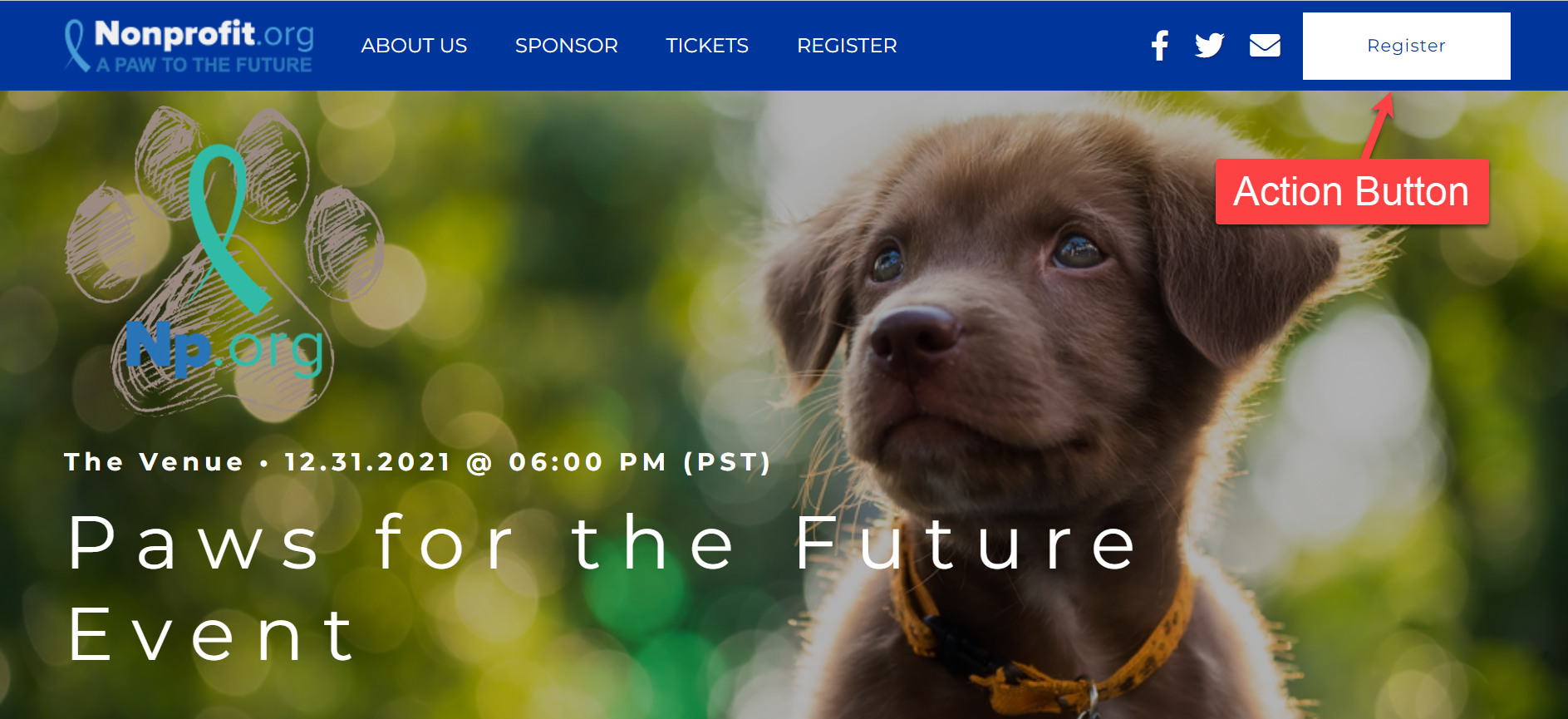
The Banner is fixed at the top of your Activity Landing Page. It stays visible in either desktop or mobile view even when you scroll. The Banner is an ideal location for your logo and links.
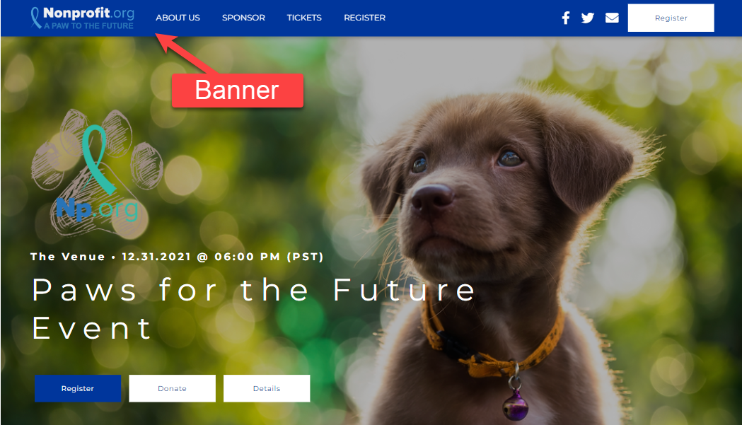
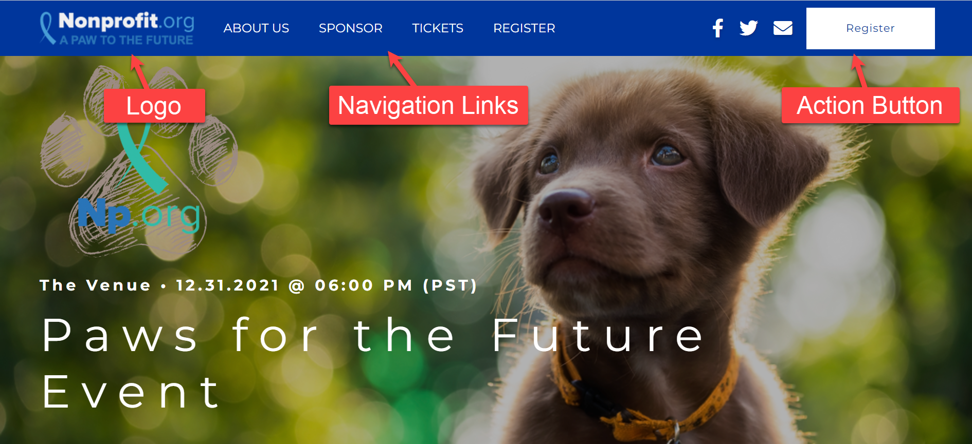
 The Banner section can include a logo, different navigation links and a primary action button.
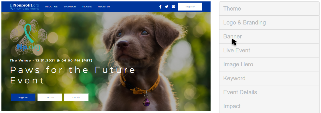
Edit the Banner Section by selecting Banner in the Activity Landing Page designer.
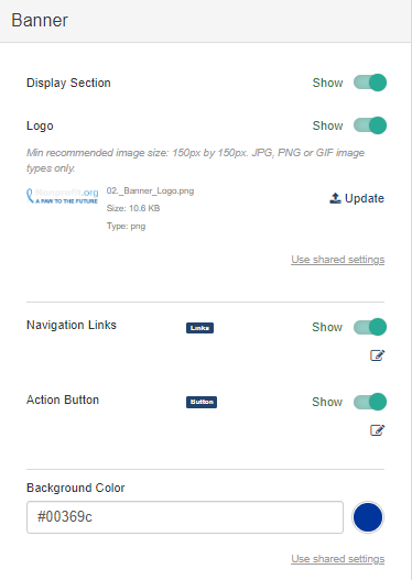
Display Section
If you decide against using a Banner section, you can hide the entire banner with the Show/Hide switch. When you do this, the Hero section will reach to the top of the page instead.
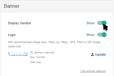
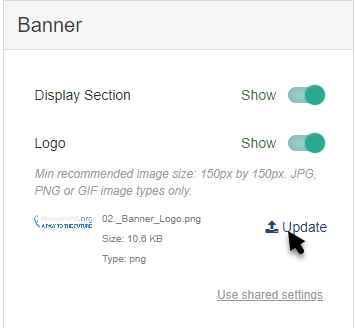
Logo
By default, the logo that appears in the banner is the logo that is set in the Activity Landing Page's Logo & Branding section, but can be changed here by clicking Update.
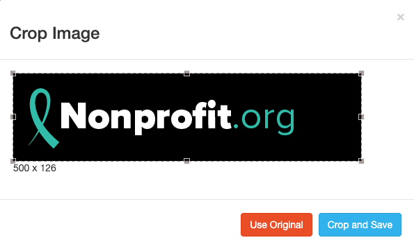
Select an image from your system to upload.
Crop the image as needed and click Crop and Save or select Use Original.
For best results, the Logo should be at least 150px by 150px. It doesn't need to be square, though. For more information on Image Sizes, click here.
If you don't want an image in the banner, you can hide it by clicking the Show/Hide switch.
Navigation Links
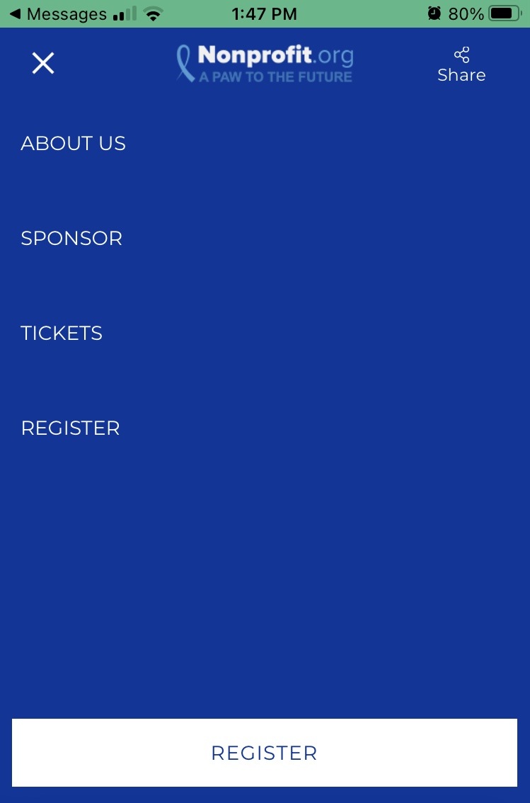
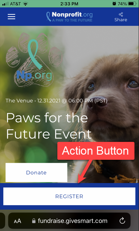
You can use the banner as a navigation bar by providing up to five links. On a smaller display, such as a mobile device, the navigation links will appear in a "hamburger" menu that can be tapped to expand and show the links.
If you do not want to use Navigation links, use the Show/Hide switch or don't enter any.
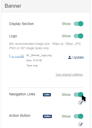
The edit button below the Show/Hide switch will allow you to add, remove, edit or move your navigation items.
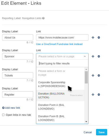
The Display Label can be up to 12 characters long and will show as the title of the link in the banner.
The Link defaults to a drop down menu where you can directly add the link to any other form within the campaign. Start typing the name of your form to narrow your selection.
You can also click Use an external link instead to direct your supporters to another URL page. If you change your mind about using an external link, click Use a GiveSmart Fundraise link instead to revert to the original design.
To reorder the links, click and drag the arrows icon of the item you wish to move and drop it into the correct position.
To delete a link, click the minus icon to the right of the line.
By putting a check in Open links in new tab, any of your links that you create here will open in a new tab instead of the existing page. This allows your supporters to explore your links without actually leaving your Activity Landing Page; it will just be in a different browser tab.
Make sure to Save the links when edits have been made.
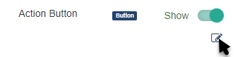
Action Button
The Action Button appears in the upper right of the banner in Desktop and Tablet views and across the bottom in Mobile views. This is usually used for the most important action you want on your Activity Landing Page. If you're driving people to the page to purchase tickets or register, then have it go to your registration activity. If your focus is donations, then assign the button to the donation form.
You can remove the Action Button from the banner by switching the Show/Hide switch.
Click the edit icon to rename the button and choose what activity you want it to go to.
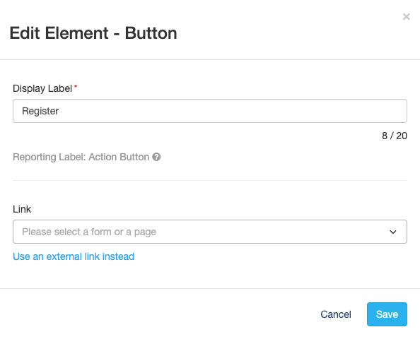
The Display Label is what appears on the button itself and can be up to 20 characters long.
The Link defaults to a drop down menu where you can directly add the link to any other form within the campaign. You can start typing the name of your form to narrow your selection.
You can also click Use an external link instead to direct your supporters to another URL page. If you change your mind about using an external link, click Use a GiveSmart Fundraise link instead to revert to the original design.
Background Color
To change the Background Color, enter a color's hexadecimal code or click on the color picker to select the color of your choice. Use the color bar and circle to select. There are default colors you can use as a starting point. Once you've selected a color on the color picker, click apply.

With your Banner set up, your Activity Landing Page is now nicely framed and you can start entering the images and content in the main sections as described in the Activity Landing Page Design article.